Tailwind is badly designed
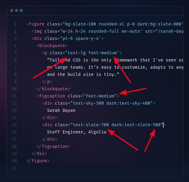
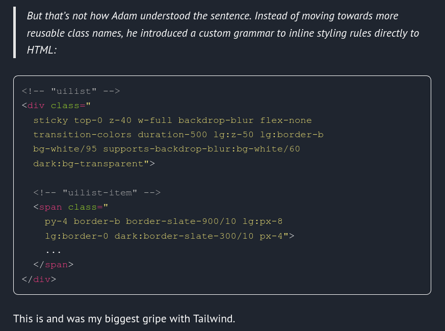
I heard about Tailwind and looking at its documentation I thought there was something wrong with it. At the time I was surprised by the many fragmented classes that had to be set. Now that I look at it more closely, HTML semantics are basically not used, contextual styling is almost non-existent, and instead there are hundreds of CSS classes that have to be repeated with almost every tag. This results in a terribly large HTML source (“HTML bloating”), slows down development (you have to remember and constantly rewrite hundreds of classes), makes documents unreadable. And by having to repeat classes for elements of a certain type Tailwind violates DRY .

The Anti-Pattern
When I look at Tailwind based styles and see classes defined for specific colors, such as yellow, I wonder what the purpose of this is. This will sooner or later lead to a horror like the one below, just because no one bothers to replace hundreds or thousands of instances of the yellow class in every possible link:
.yellow {
color: red;
}
Moreover, there is a builtin supoort for aliasing! You are encouraged to do so.

These are bad CSS
practices, this is a typical anti-pattern
. And,
unfortunatelly, this anti-pattern is a core concept of Tailwind. The
proper way is to style elements and component semantically, like
<article>, <a>, <address>, <div class="my-custom-component"> (or <MyCustomComponent>, if using custom tags). Yes, HTML5
was introduced for better semantics in documents, and we now can use HTML5 Custom Elements
!

The same plague has struck Tachyons CSS , which is the core of Ananke Hugo Theme , which is used in this blog. Believe it or not, there’s no way to style this site nicely without overriding the templates, which makes customizing and upgrading more difficult.
How it should be done
A CSS framework should be based on SASS, where macros, mixins, partials, configurations and other solutions that have long existed in SASS would be used to build the target style (or its structure). A good example are the styles in the BlueprintJS library, where the SASS is used to build BlueprintJS’s themes, and where most variables and classes have the correct semantics . As a result, the Blueprint theme is easily customizable with SASS and pure CSS .
Tailwind tries to be such SASS at the HTML level, which simply cannot succeed at large scale and long project maintenance. Its extremely growing popularity must be due to two common things - the lack of knowledge and the snowball effect.
Final thoughts
From what I see Tailwind there are a lot of ready-made components, but since they are prepared in this way, I can imagine the difficulty of adapting them to a consistent look of the whole. I am not surprised by the large community of Tailwind’s opponents , but I am terrified by the huge number of its supporters.
So if you want to get stuck quickly, struggle with unmanageable code, lose code readability, or simply don’t care about maintaining your project - use Tailwind.
Adam, don’t go down that road! ;)

saba.jpg
Please read for more details:
- https://blog.shimin.io/why-i-dont-use-tailwind-in-production/
- https://sancho.dev/blog/tailwind-and-design-systems
- https://gomakethings.com/tailwind-is-bad/
- https://romgrk.com/posts/tailwind-bad/
- https://www.aleksandrhovhannisyan.com/blog/why-i-dont-like-tailwind-css/
- https://en.wikipedia.org/wiki/KISS_principle
- https://www.linkedin.com/pulse/decoding-hype-why-tailwind-css-might-your-best-bet-large-scale-koc
- https://johanronsse.be/2020/07/08/why-youll-probably-regret-using-tailwind/